Early Student Work
As a student at Bath Academy of Art, I loved the craft-based, hands-on approach to design that was a feature of the teaching there.
Many posters were commissioned that relied on ‘back of an envelope’ concepts, which generally worked quite well, although the execution shows my lack of practical experience. Competition to design posters for college events was fierce and the resulting standard was high.
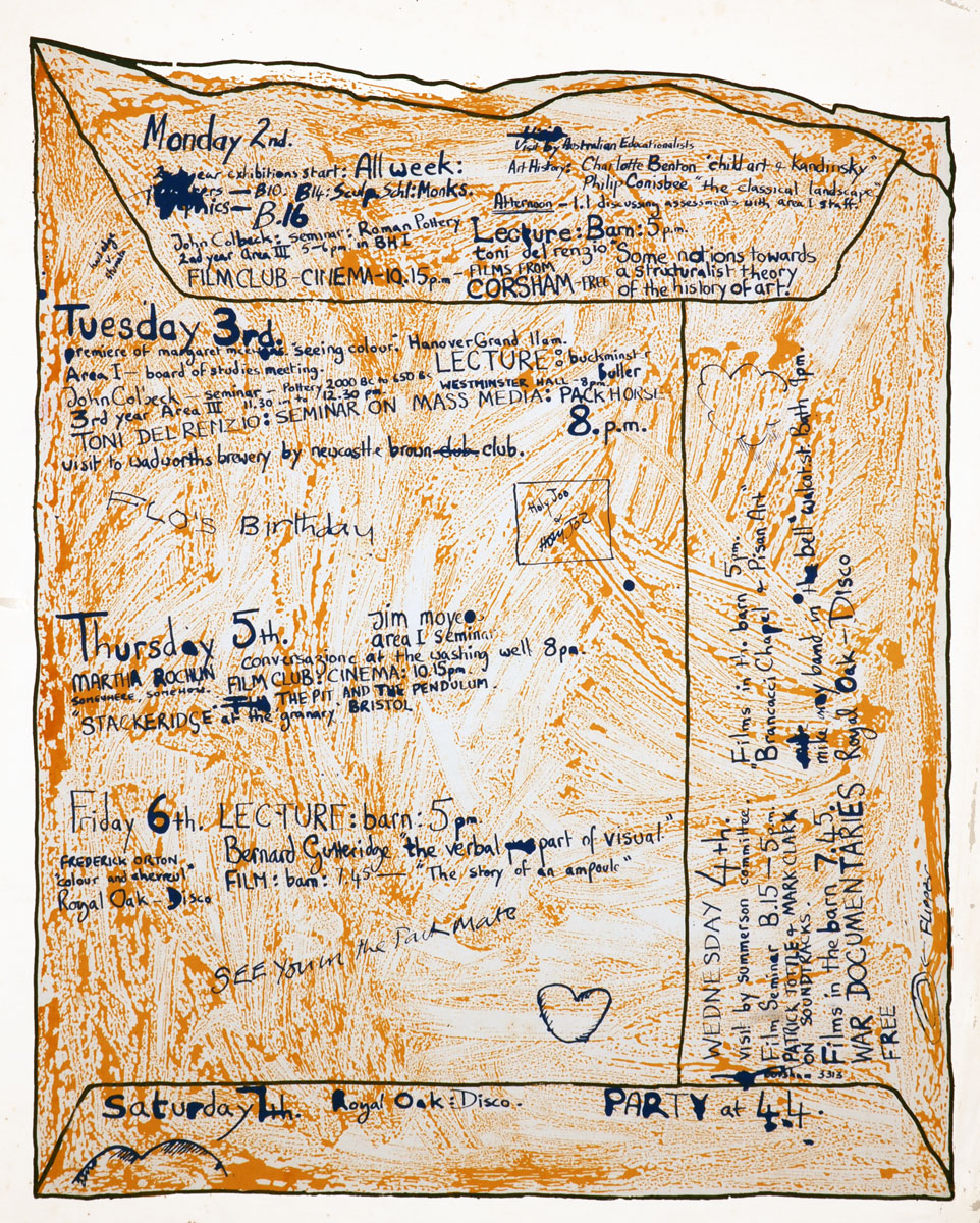
The true challenge was to produce something memorable, knowing full well that you would have to do your own production and print. This certainly developed my print production skills. Hand-drawn 3 colour litho-stone printing was a typical production process – very touchy-feely.
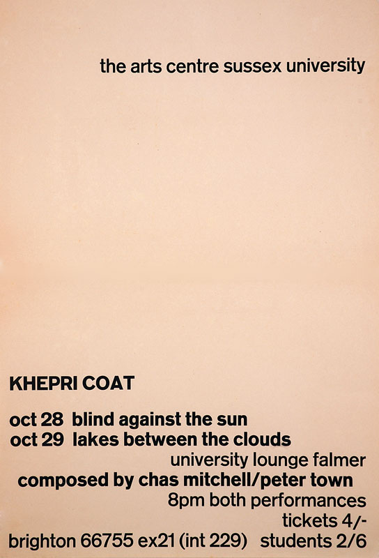
Designs for exhibition panels were produced from my hand-drawn artwork silk-screened onto board, and a poster for an event at Sussex University used letterpress printing from handset type. Printed on newsprint, the yellowing effect was a planned Part of the design.

Resurgence Magazine
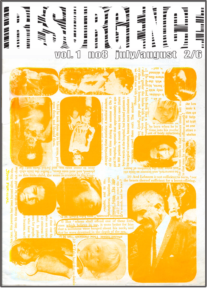
It is 40 years since I undertook my first commercial commission to design and artwork a masthead for the slightly ‘alternative’ magazine, Resurgence, but the memory is still very fresh.
Something that would probably take less than half an hour to complete today using Illustrator, took me a week to do. Good to see the magazine is still flourishing with its by-line ‘at the heart of earth, art and spirit’ – the perfect sentiment for the 21st century, it seems.
History of the English Speaking Peoples
During the late sixties, while still at Bath Academy of Art, I worked as a junior designer for a magazine publisher.
David Collins, the Art Director who employed me at publisher Peter Dunbar, gave me plenty of responsibility both designing and organising some of the production.
The fast pace of magazine production and unbending schedules was ideally suited to my personality, and this provided an exciting early episode in my career as a graphic designer.
My journey as a graphic designer, an introduction
Part 01 – 1960s In the Beginning: Undergraduate work
Part 02 – 1970s The Royal College of Art & The Advent of Colour
Part 03 – 1970s Starting Out in the Real World
Part 04 – 1970s My First Major Client
Part 05 – 1970s More Than One Man
Part 06 – 1970s Striking It Lucky
Part 07 – 1970s Embracing Ground-breaking Techniques
Part 08 – 1980s Changing Roles for Designers
Part 09 – 1980s Our First Technology Client
Part 10 – 1980s Growing Through Recommendation
Part 11 – 1980s The Dream Client
Part 12 – 1980s Moving into Corporate Design
Part 13 – 1990s Ramping Up the Workload
Part 14 – 1990s Graphic Design goes Global
Part 15 – 1990s A Steep Learning Curve
Part 16 – 1990s Working for The Nation’s Favourite
Part 17 – 1990s The Challenge of the Future
Part 18 – 1990s Picking up the Crumbs
Part 19 – 1990s Vested Interest
Part 20 – 1990s Setting the Standard
Part 21 – 1990s Still Growing after All These Years
Part 22 – 1990s New Business from Old
Part 23 – 1990s Keeping up with Demand
Part 24 – 1990s A Full-Service Consultancy
Part 25 – 1990s Into the Unknown
Part 26 – 2000s Learning New Tricks