Colour – the luxury option
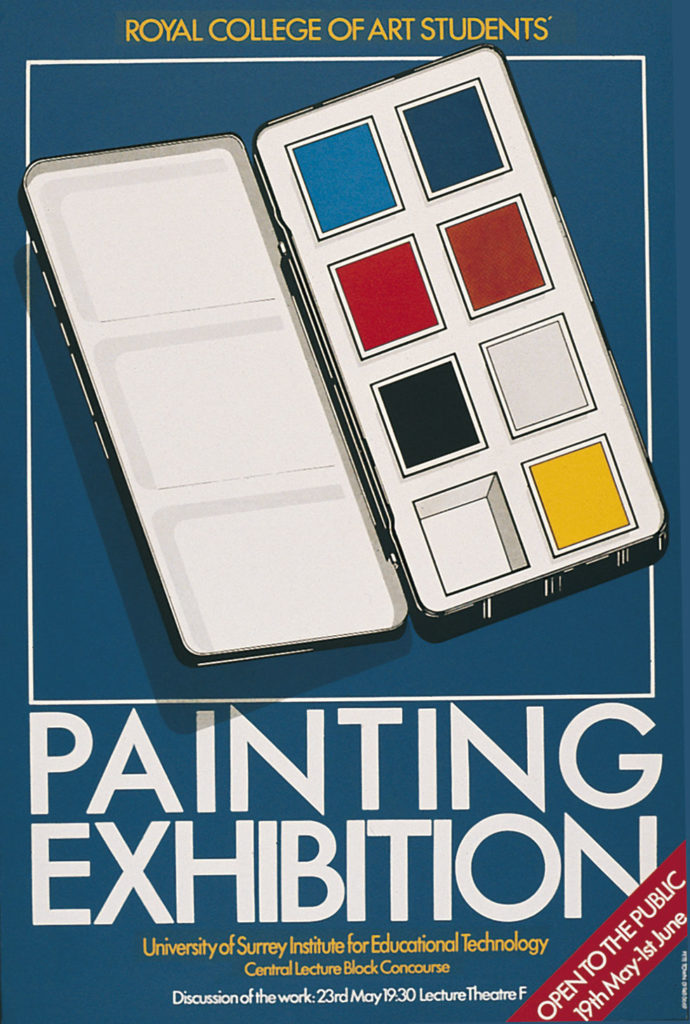
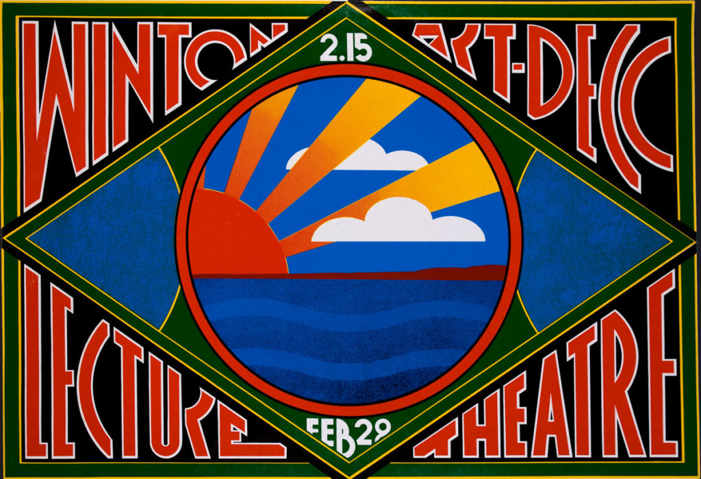
In the early days, most printed items were in black and white. Colour was a luxury restricted to use on magazine and book covers, and in top-end advertising.
The worst option was ‘two-colour’ printing, which clients thought would give them an advantage, but invariably produced a most unappealing, muddy result, and never justified the extra cost.
Making a point
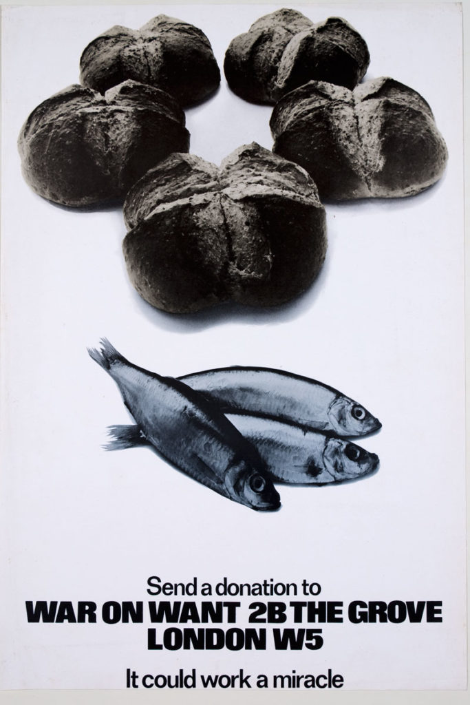
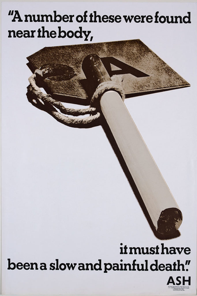
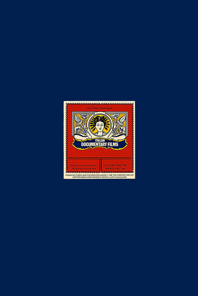
Early work from my days as a student at the Royal College of Art demonstrates a visual style typical of its time.
Uncluttered typography, clear visuals – more often than not photography, and in many cases a duo-tone – and a bit of work to be done by the viewer to comprehend the complete message.
My journey as a graphic designer, an introduction
Part 01 – 1960s In the Beginning: Undergraduate work
Part 02 – 1970s The Royal College of Art & The Advent of Colour
Part 03 – 1970s Starting Out in the Real World
Part 04 – 1970s My First Major Client
Part 05 – 1970s More Than One Man
Part 06 – 1970s Striking It Lucky
Part 07 – 1970s Embracing Ground-breaking Techniques
Part 08 – 1980s Changing Roles for Designers
Part 09 – 1980s Our First Technology Client
Part 10 – 1980s Growing Through Recommendation
Part 11 – 1980s The Dream Client
Part 12 – 1980s Moving into Corporate Design
Part 13 – 1990s Ramping Up the Workload
Part 14 – 1990s Graphic Design goes Global
Part 15 – 1990s A Steep Learning Curve
Part 16 – 1990s Working for The Nation’s Favourite
Part 17 – 1990s The Challenge of the Future
Part 18 – 1990s Picking up the Crumbs
Part 19 – 1990s Vested Interest
Part 20 – 1990s Setting the Standard
Part 21 – 1990s Still Growing after All These Years
Part 22 – 1990s New Business from Old
Part 23 – 1990s Keeping up with Demand
Part 24 – 1990s A Full-Service Consultancy
Part 25 – 1990s Into the Unknown
Part 26 – 2000s Learning New Tricks